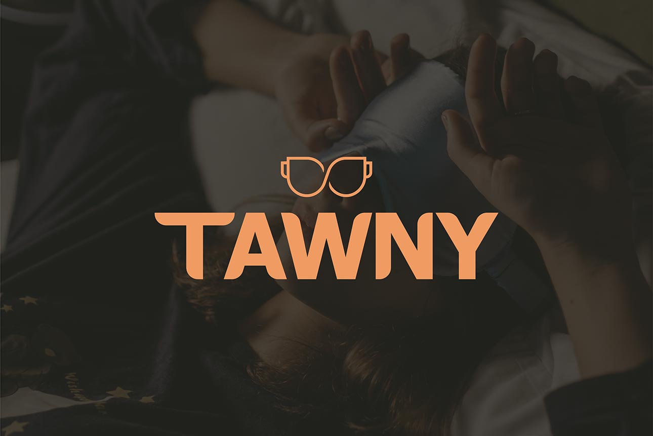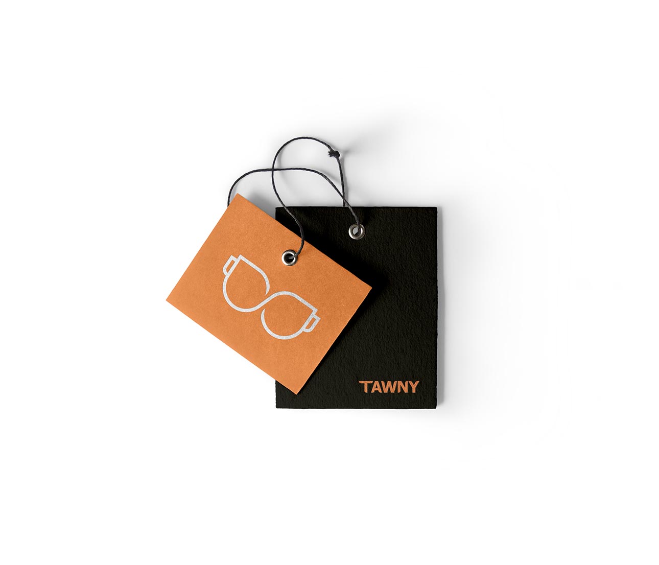

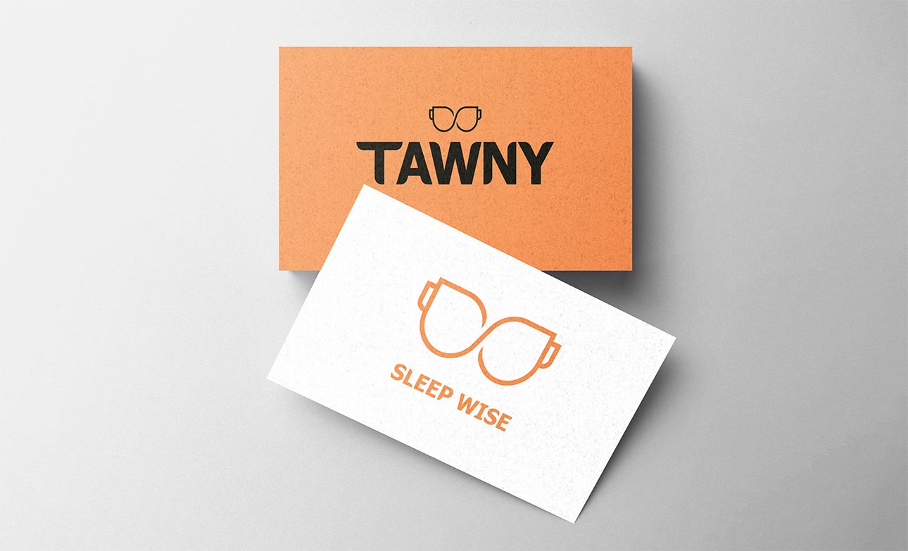
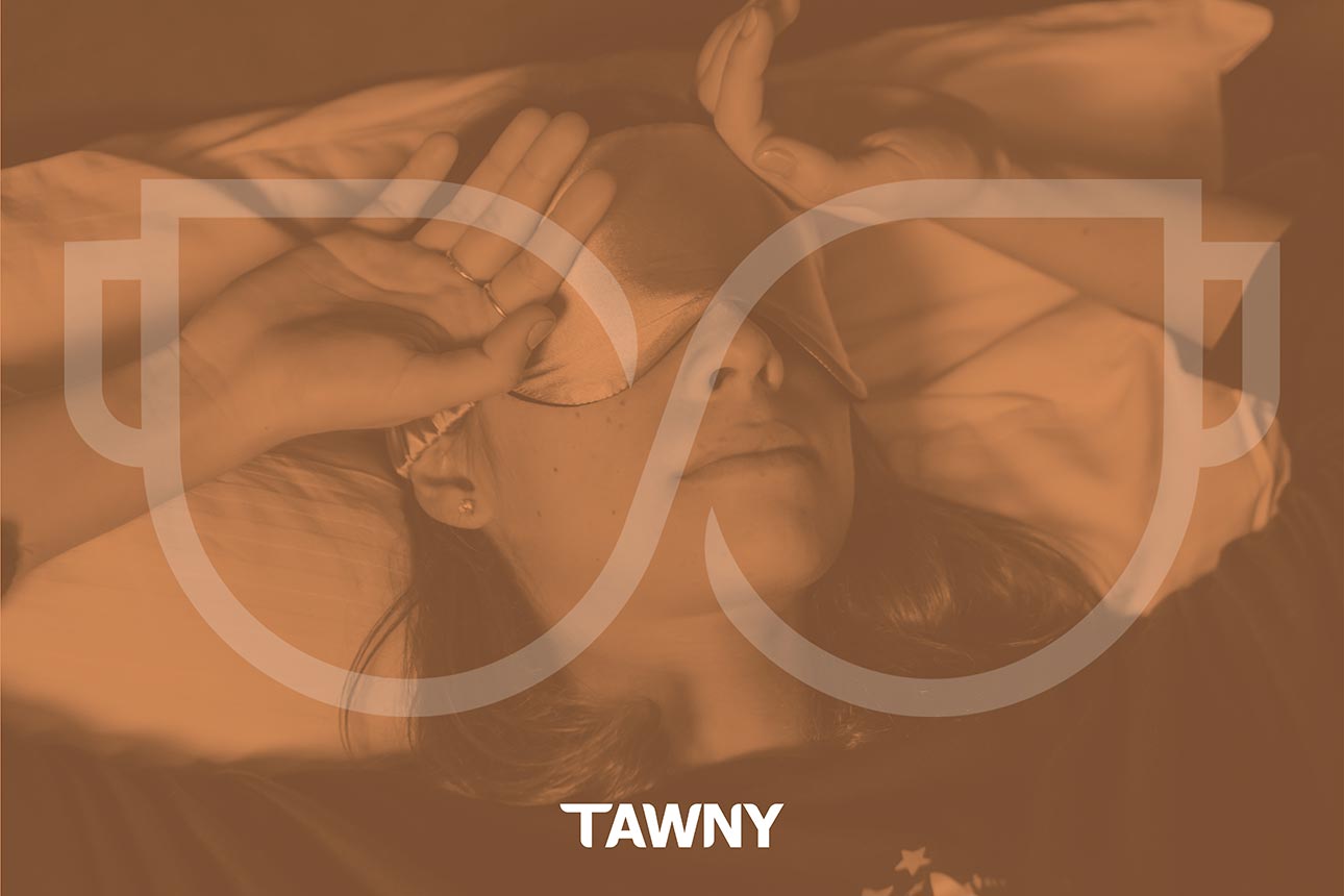
Our aim was to merge both what Tawny products have on offer with customers’ current situation. Visuals and colours that they can relate to but also make them reminisce past experiences allowing them to send customers the message that they can now relive those memorable moments once again. The colour orange was used due to its warmth and emotional balance creating a strong communication path between both parties. This is particularly effective when combined with simple visuals that carry with them a greater weight of powerful messages. Implicating that they can, from this moment on, sleep, dream, and wake up to succeed with the help of Tawny’s sleeping masks.

This client is a new starter business selling sleeping masks looking after a new brand identity to represent their product.

By creating a typeface and logo identifier we were able to deliver an exciting new brand for Tawney’s sleeping masks and feed the enthusiasm of the client into the brand itself.